« This Is Not The Droid You’re Looking For | Home | Why Am I Writing eBooks When I Don’t Even Own A Kindle? »
The Revolution Needs A Graphic Designer
Topics: Lifestyle & Culture | Add A CommentBy admin | October 13, 2011
As soon as Occupy Wall St starts using professionally printed signs and posters we can assume the movement has been hijacked, but could we at least lose the “20th century Soviet” and “60′s Power Fist” motifs?
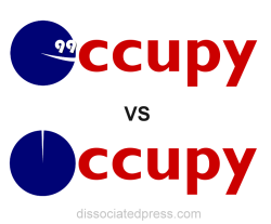
 I’ve personally begun A-B testing for the revolution. |
If you’ve visited DissociatedPress.com with any regularity over the last few years, you know that I’ve been a bit annoyed with Wall Street since 2008 , when the industry built on gambling your hard earned dollars on sophisticated ponzy schemes to line billionaire bankers’ pockets with bonuses came tumbling down like a lost weekend in Vegas. Except when the hustlers lost their wad and woke up with a brain splitting hangover, they somehow managed to convince everyone to float them JUST ONE MORE TIME, swearing they’d mend their evil ways. Well, like any addict struggling with an addiction, they lied of course, slipped themselves a bunch more bonuses and wild parties just months later, and in the big picture, pretty much broke capitalism in the process. So it was with some excitement that I started watching the Occupy Wall St movement begin to gather steam last month; I even set up a site at OccupyAnnArbor.org, figuring if the movement didn’t arrive in my town on its own, I would HELP it arrive. No worries there though, within a few days of creating the site, about 1200 people had gathered spontaneously on one of the many Facebook groups that had suddenly popped up. Which is what I think the power of this movement is; it is genuinely grass roots and citizen-driven. People make fun of the cardboard signs being used at most gatherings, but to me those signs are a GOOD thing. As soon as we start seeing a lot of professionally-produced signs, we can probably assume the movement has been co-opted by a particular party or interest group. But that doesn’t mean we have to prove the “none of us is stupid as all of us” adage is actually TRUE. I think all the ninety-niners (see what I’m doing there?) should take a moment to read Frank Luntz’s Words That Work, and maybe Lovemarks, the brilliant book by Kevin Roberts about why we love the brands we love. The reason to read that first book is because Luntz helped the GOP understand the winning strategy of “it’s not what you say, it’s what people hear”, and the reason to read the second one is because it might help protesters understand that as much as using a black power fist makes you feel like you’re partying with Jimi Hendrix and Malcolm X, it makes the casual viewer think you’re a naive socialist who is out to undermine the American way of life. So while lots of artists like Shepard Fairey and Rob Sheridan are offering up free designs, I think even these talented designers are going a little too “oppressed laborer” with the imagery. So I’ve assembled a few images and ideas of my own about how to reframe the revolution a little. Feel free to chime in or share some interesting thoughts of your own, and if you’re looking for some inspiration, there’s a healthy collection of motifs here.
Language & Message
First of all, some simple thoughts on message and agenda. One of the funniest quotes I’ve heard recently was when a friend said “The problem with Occupy Wall Street is that they don’t have a single clear talking point I can sarcastically dismiss.” Which is the bright side of the the complex message behind the movement. It’s real. It’s human. It’s palpable. And therefore it doesn’t fit into a soundbite. All the same, there’s no sense fogging it over with demands for dismantling the American way of life and the immediate elimination of automobiles, or whatever.
Keep it simple
It’s about corporate influence peddling, corruption, and failed representation of the citizenry. Bankers, politicians, and corruption. Stop trying to roll in health care, war, big oil, environmentalism, gay rights, Social Security, film incentives, and your vision of a perfect socialist world. That’s for later, and that’s how politicians work. They start with simple values and sneak in all their pet agendas in the final demand, making it impossible to know what their values really are.
Don’t Accept Party Support
No matter how much you like the values of that party’s platform, they don’t give a shit about you. They just want to harness you as a voter block. The recent endorsement by the Democratic Party should is anathema. It’s sort of like having Charles Manson or Bernie Madoff say what a great guy you are. Union support is iffy, but very probably okay, if the looser “Occupy” brand stays intact.
Don’t Wait For Instructions
It was people who love being in charge who got us into this mess. Why would you wait for instructions from someone who feels like coming up with a list of instructions at a time like this? I can’t tell you how many downward-spiralling groupthink threads I’ve seen on the web where intellectual liberals did the intellectual liberal thing and talked an idea into oblivion instead of just DOING something. These are my instructions to you: don’t wait for instructions. Just DO SOMETHING. Your heart is probably in the right place.
Visual Design
I wish the firm that did much of the 2008 the Obama campaign materials – celsiusDesign – would step up and volunteer their services. The brilliant typography and visual theme choices made by that firm probably had as much influence on Obama getting elected as his campaign stumping did. In the primaries, Hillary’s stodgy and reliable-looking design themes made her campaign look crusty and slow in the head, and in the actual election, McCain’s material looked like signage for the local military recruiting office.
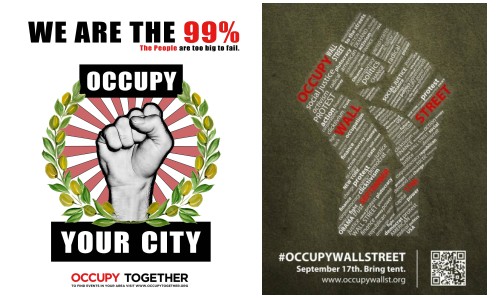
The Not-so-invisible hand, i.e: The Fist
This image, while it probably satisfies some occupiers’ sense of rebellion and solidarity, probably says to the casual viewer “I am a communist who wants to ruin your economy even more”. And in some cases, this may even be partly true, as in the case of some of Occupy LA. members.


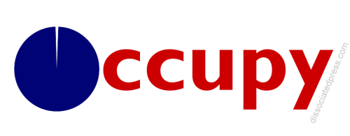
Below is my first stab at a new look for the revolution, followed by the theory and design guidelines:

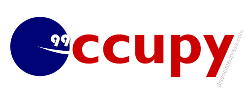
The first thought was that “We Are The 99%” and “Occupy Wall St” have built enough basic brand identity that it might be possible to merge the two in simple graphical fashion. Since people are “Occupying” all over the country, I thought I’d drop the “Wall St” and lose the “We Are”, representing the 99% idea more graphically. Some basic guidelines were to use a common legible typeface, and graphical elements that avoided gradients or 3D elements, so they would be easily reproducible. I also went with red, white, and blue, for the obvious reasons that the colors display patriotism, and include both major parties’ colors. But as I tried a lot of typefaces and arrangements of the “99″, I realized the tendency to do the “cutesy eye thing” was overwhelming, and while fun, kind of diluted the message. So in the end, I dropped the 99, figuring the pie chart “O” said it well enough:

Feel free to criticize, I’m not actually a graphic designer.
I also adapted the original AdBusters “Wall Street bull” motif for OccupyAnnArbor.org weeks ago. If you’re familiar with Ann Arbor’s “Diag” area, you’ll recognize that the bull looks right at home on its brick-paved central meeting plaza:

We’ll be featuring a collection of images from around the web in an upcoming piece, feel free to suggest a link in the comments…
