« Canada Invades US – With Indie Music | Home | Hank Paulson Could Sell An Ice Cube To An Eskimo »
Infoporn & Data Addiction
Topics: Technology | Add A CommentBy admin | September 15, 2009
Our endless plot to chart your demise by making you view graphic depictions of life, work, and money.
 Now that there’s an Internet Addiction Treatment Center, I wonder if there are plans for a treatment center for infographic addiction? As I pondered this, I wondered, of course, what a “no graphs infographic” would look like. My quick prototype is on the left. Which raises an interesting question: If infographics are such a powerful communication tool, why am I writing about them? We’ve touched on flow charts and a variety of amusing infographics before, but there seems to be an endless supply of them. I’m especially partial to the kind that puts incomprehensible things into tidy visual form, like what does a million dollars like? Which is why I especially like What If You Printed the Internet? Economic data is also always more palatable when viewed graphically, as in this Good Magazine piece. A bunch of little “MSN Buddies” out of work are much cuter than a photo of a bunch of haggard hungry people in line. Technophiles in particular are naturally drawn to data visualizations, which is why the food-group-like pyramid graphics Balance Your Media Diet and The Hierarchy of Digital Distractions have made the rounds lately. It’s interesting that “gaming” and “device failure” top the respective pyramids. If I don’t get treatment for my little graphic addiction problem, I’ll be back with more soon. But if you’re yearning for more now, check out some of the sites below for more interesting data visualizations. But first, can someone explain to me what Iowa’s problem is?
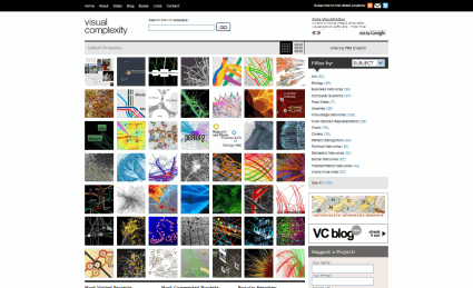
In spite of its simple interface, Visual Complexity is just that. Kind of complex.
Lots of interesting projects and software apps for visual data presentation.
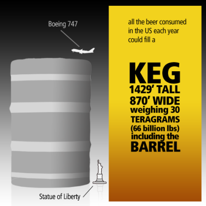
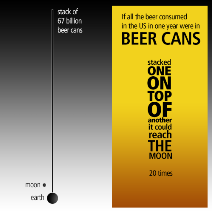
The guy at WallStats got known for his Death and Taxes Poster
I’m personally more amused by things like his beer infographics:
Good Magazine is a personal favorite of mine partly because I’m sort of a magazine fetishist, but even more so because they produce some of the coolest infographics that end up going a little viral. Always thematically clever, and always on hip, important, and progressive topics:
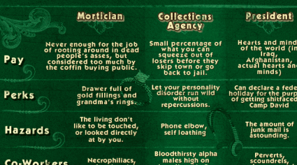
The people over at MadAtoms do irreverant, sometimes even mildly offensive infographics in a style uniquely their own. The Recession-Proof Jobs Manual is on the milder side of their best work:
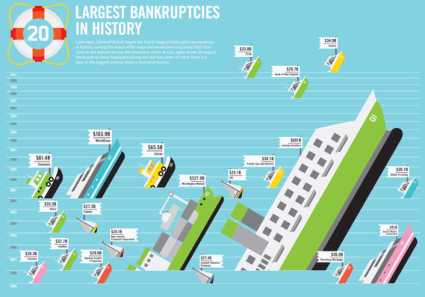
A Few More:
Cool Infographics is a blog maintained by Marketing and Product Development professional Randy Krum, Information Aesthetics is a similar site designed and maintained by Andrew Vande Moere, and Chartporn is a collection managed by Dustin Smith, an economist in Washington DC