« Does God Really Hate Fags? | Home | Copyright Law Isn’t All It’s Quacked Up To Be »
Monday Morning Meticulously Mapped Out?
Topics: Editorial & Opinion | 1 CommentBy admin | June 8, 2009
Axis if we care. Our plot to disrupt the day you’ve carefully charted for yourself involves graphic depictions of death, birth, crime, and…Wikipedia?
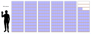
 Do you ever feel overwhelmed with the information and sensory input at your disposal these days? We’re here to help. Overwhelm you more, that is. In our ongoing plot to derail your Monday morning, we’ve touched on fleshmaps, facebook maps, why Ian can’t get a date maps, infographics, flowcharts , and million dollar graphics. So you’d think we’d be done, right? But no. Here we have 50 more examples of ways to visualize data, brought to you by WebDesignerDepot.com. Of all of the examples presented, I probably found TuneGlue the most useful; it visually cross-references musical artists and their work in a very simple interface, with Amazon links. By the way, a lot of those tools in that link made pretty graphs, but were in most cases visualizing things normal people don’t care about. And there’s definitely a flaw in the plan when a graphic actually makes it harder to understand complex information rather than easier. So check out 5,000 years of Middle East history in 90 seconds, or BreathingEarth, where you can watch deaths and births in real time and ponder your emissions. Even better, WorldClock displays everything from oil consumption to US crime stats in real time. And lastly, have you ever wondered what Wikipedia would look like if it were in book form?
Posted by » Infoporn & Data Addiction - Dissociated Press on 09.15.09 3:16 pm
[...] tool, why am I writing about them? We’ve touched on flow charts and a variety of amusing infographics before, but there seems to be an endless supply of them. I’m especially partial to the kind [...]